Fuji Bridex
A simple factory, given thought and executed with rigour, demonstrates that even the most utilitarian of buildings with modest budgets can be lifted to respectable levels.
The 5 storey factory is the new production facility of Singapore's premier electrical switchgear manufacturer.
Its tight budget, spent mostly on heavy structure and services, meant little was left for its architectural treatment, putting it at risk of fading into the sea of mediocre big box architecture.
The limited resources pushed the design focus toward establishing a legible architectural parti of primary forms, shaped quite literally by its context and function. The language of the factory vernacular is familiar, but with a twist.
Singapore
Architecture, Interior Design
Industrial
2018
3,713 m2
7,908 m2
Albert Lim KS, Joseph Goh
Location
Discipline
Typology
Completion
Site Area
Area
Photography


The first 4 levels house the main production areas, expressed as a painted dark grey block punctuated by punched openings responding to ventilation and fire smoke control system requirements.
Offices occupy the front of Levels 2 to 4 and the entire 5th, contained in a pristine white aluminium cladded cuboid.
A tall inverted-L canopy shades the loading bay and frames the signage wall, marking the entrance clearly.
These 3 elemental forms interlock into a clear 3-dimensional composition. The white cuboid hovers over and shades the reception lobby from the western sun. A blue 'paint splodge' marks the highest corner, visible from afar.

Windows and louvered openings punctuate the building seemingly in a random manner, their positions actually responding to ventilation and engineered smoke control system requirements.
The 1m wide openings match the width of the aluminium cladding panels, simplifying both the elevation design and construction.


A copper cladded cube suspended within the reception lobby acknowledges the critical role that the metal plays in the business.


Within the tight budget, substance always prevailed over style. Every single opening was provided with drip sills that prevented streaking and kept the dignified facades clean.
These often uncelebrated but critical functional elements created a surprising but delightful texture on the façade.
A unique aesthetic emerged from the necessary.


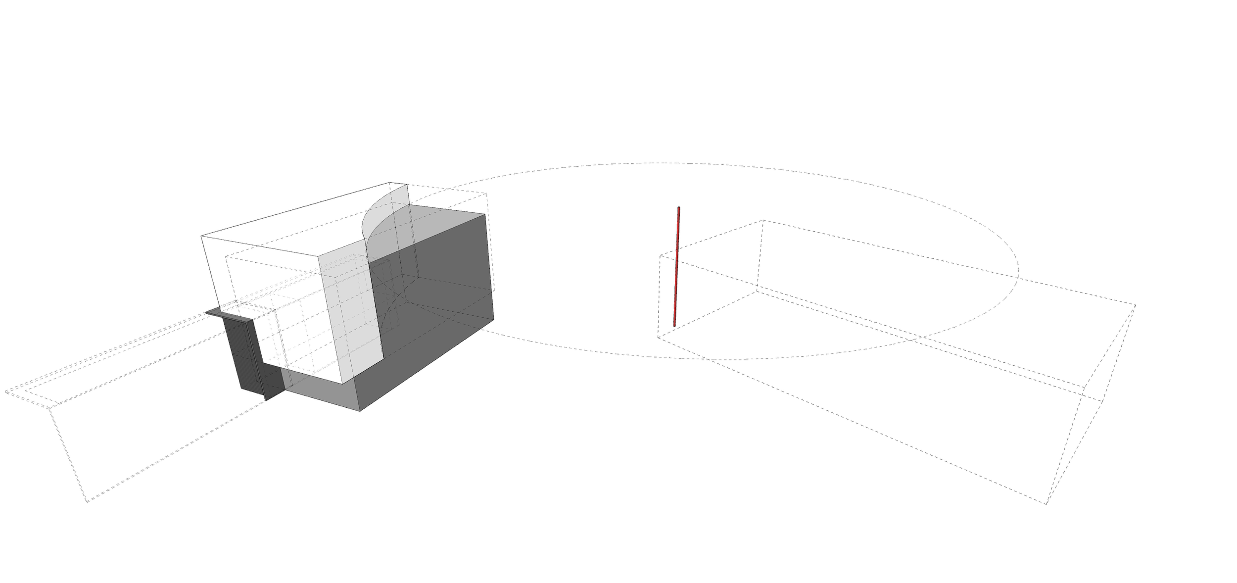
Behind the site stands a food factory with a chimney. NEA guidelines stipulate a 100m radius about the chimney, within which buildings must be 3m lower. This radius cut into half of our already maximised building footprint. Parts of the taller white cuboid encroached into it.
To comply, the offending bit was simply subtracted and carved away according to the radius, generating a sweeping arc of glass that opens up the 5th floor office to the roof terrace.
Like an urban poche, this blatant stroke at once inscribes the building right into its context.
This project alludes to the enduring efficacy of a pragmatic approach to architecture that can lift the most utilitarian of buildings with modest budgets and architectural ambitions to respectable levels. Even one or two uncomplicated moves, given thought and executed with rigour, can make good architecture.

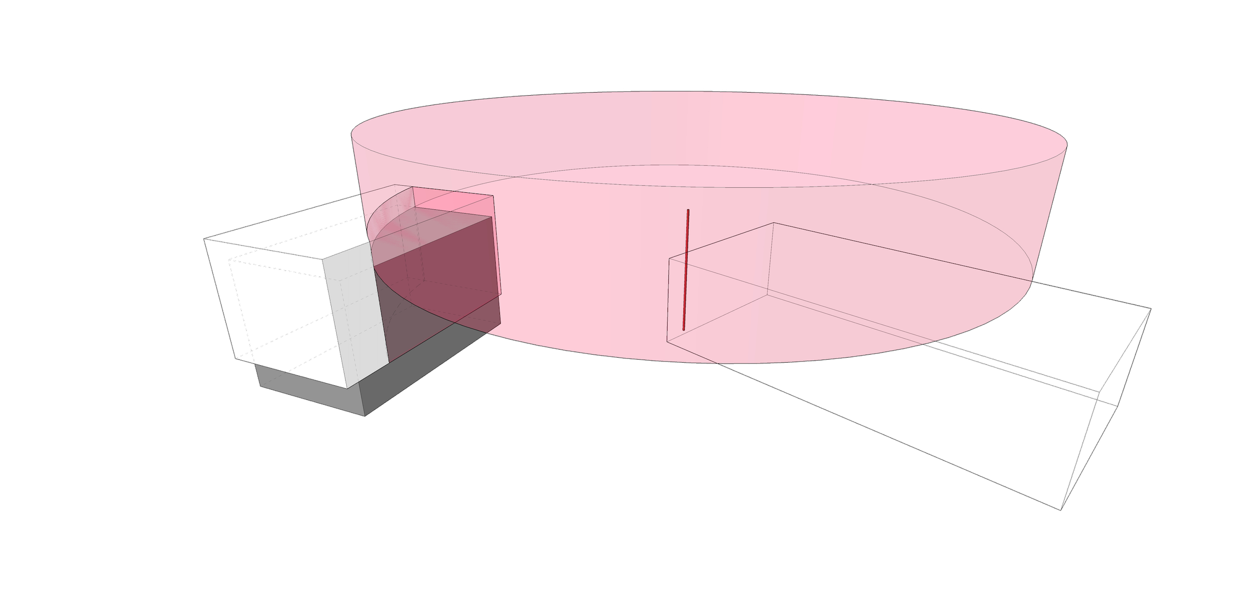
A seemingly restrictive authority regulation was capitalised upon, becoming the critical design generator that gave the building its unique form, in its unique place.